 What stays the same?


It used to be acceptable to have a desktop only website but in this day and age your business website simply must be mobile-friendly.
Our internet usage has changed dramatically because of the uptake of smartphone and tablet devices, and that shows in the stats: mobile now represents 65% of digital media time (comScore report 2016). Desktop use is dropping, down 12% since 2013 to 35 percent of digital time spent.
That means that more of your customers are spending more time looking for you and your services on their mobile devices.
Google says that 94% of Americans with smartphones search for local information on their phones, and 77% of mobile searches occur in places where a desktop PC is probably available.
Apart from the stats, the other reason is search traffic and rankings. Again back to Google: “If your site’s pages aren’t mobile-friendly, there may be a significant decrease in mobile traffic from Google Search”
How do I make my site mobile friendly?
If you’re using a content management system (or “CMS”) like WordPress, Drupal or Magento, you can often make your website mobile friendly by switching to a mobile friendly design theme or template. Depending on the complexity and amount of customisation in your site, that can range in difficulty from a relatively painless afternoon’s work, to weeks or months of work for a team. Most small businesses I’ve worked with have been able to get it done in a week or two, but large or complex sites will take longer.
If you’re not using a CMS then you will need to talk to your website provider – they may have mobile friendly/responsive design themes available at the click of a button, or you may need to hire a web developer to set it up.
What does “responsive” mean?
A word about mobile sites and responsive design: the web design industry has mostly moved to using a “responsive” design for a website.

Responsive web design is a design that reflows and modifies itself to fit on any kind of device and screen size. A responsive design will adapt to the viewer’s screen whether it is a desktop, smartphone, tablet device, and in landscape or portrait view. (If you’re looking at this article on a mobile, try turning your screen to landscape, or on desktop resize your browser window, and watch as it responds to the change.)
Separate mobile and desktop websites
The other option is to have separate mobile and desktop websites and manage them separately – you’ll recognise these types of mobile sites as they often have a “Desktop version” link at the bottom. Website visitors sometimes don’t like mobile specific sites as they are often missing features found on the desktop site. The other issue for most small businesses that is it’s costly and sometimes confusing to manage two separate websites.
What about making a smartphone app?
Apps are great for certain specific cases, but I would recommend small businesses start with a mobile friendly website first as they are instantly available and compatible with all systems. With apps, you need to convince the visitor of the value of your app to get them to install it, and then there are questions of development cost and which ecosystem (Apple iOS vs Google’s Android) and devices (smartphones, tablets) that you want to support.
Can I check if my website is mobile friendly?
Sure – a simple way is to simply test it on some different devices like a family member’s phone or tablet. If the text and image content is running off the right edge of the screen when the page loads, then it’s not mobile friendly.
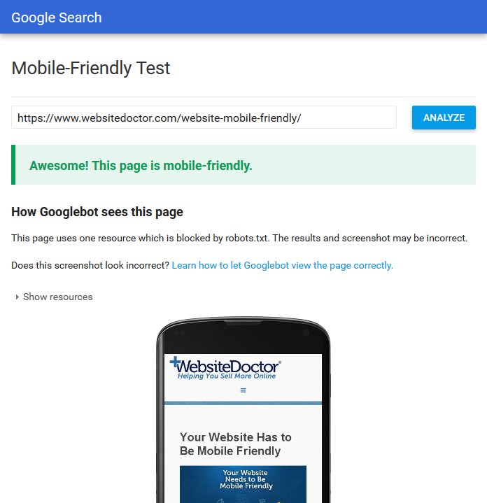 Google also helps you check website mobile-friendliness: enter your website address on their mobile-friendly test page.
If your website is not mobile friendly and you want to change that, drop me a line.